1)
Design Research
The type of magazine I decided to choose to
create is a music magazine. In order to get a rough idea about how music
magazines are usually designed, I have referred to a few music magazines with
different styles. In the end, I opted for a more vibrant and youthful layout
with minimal text. The following are some layouts that influenced my work.


References:
Beatzmag (2012) Beatz Magazine Issue 1.
Retrieved from http://issuu.com/beatzmag/docs/beatz_issue_1
Vmagazine (2012) V75 The Music Issue.
Retrieved from http://issuu.com/vmagazine/docs/v75
Flushthefashion (2012) Flush Magazine Issue
No. 3. Retrieved from http://issuu.com/flushthefashion/docs/issue3
Terry White (2008) Magazine Cover Design in
InDesign. Retrieved from http://layersmagazine.com/magazine-cover-design-in-indesign.html
2)
Conceptualization (Sketches)


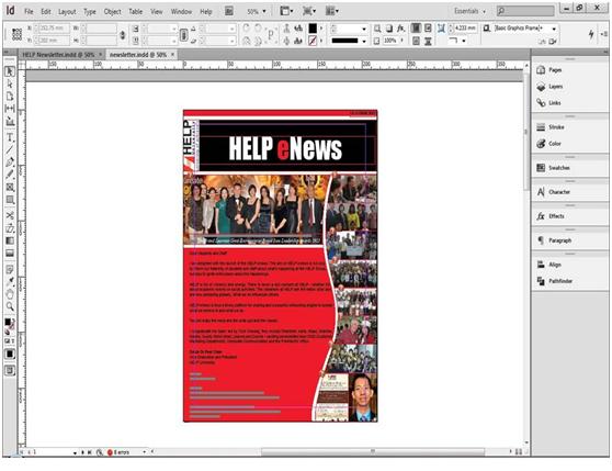
3)
Crafting

Start off with
front page, putting image as background and adjusting the size.

Creating a background box with jagged edge effect
for the masthead in magazine using Illustrator.

Placing the box created in Illustrator and
combining it with the title over the background image.

Creating a drop shadow effect on article
headlines to make it “pop out” and be more easily readable.

Placement of the article headlines to be
featured on the cover page. I had to make sure that they are arranged in such a
way that the words can be read without too much interference of blockage from
the background picture.

Splitting the text columns and adjusting
the gutter space.

Placing the pictures selected and arranging
them to frame the pages.

Creating columns and placing dummy text
evenly in each column.

Adjusting the hyphenation settings for the
texts.

Creating the title and adjusting text fonts
for the feature story content page.

Creating a background colour using gradient
effects for the content page. Note: this was later removed as it made the text
hard to read and straining to the reader’s eyes.

Creating and adjusting the editor’s note
text.

Creating the content list and page numbers.
Making sure they are all aligned.

Adjusting text and images on new content
page. Adjusting the justification of the text as well as hyphenation.

Creating a box behind the text to make the
text stand out. Note: this was later removed.

Editing picture in Photoshop to remove the
white background from the orginal image then saving it as a .gif file for later
placement in magazine layout.

Creating a simple advertisement as one of
the pages in the magazine.

Finalizing the elements in the
advertisement page.
4)
Final Artwork
After a few more adjustments here and there
with the design, this is the final artwork that I have produced:


Image sources:
Fanpop. Avril Lavigne Wallpapers. Retrieved
from http://www.fanpop.com/clubs/avril-lavigne/images/22661431/title/avril-lavigne-wallpaper
WallpaperVortex.com. Avril Lavigne
Wallpapers. Retrieved from http://www.wallpapervortex.com/wallpaper-1209-celebrity_avril_lavigne_wallpaper.html
Pulsarmedia. Avril Lavigne Wallpaper.
Retrieved from www.pulsarmedia.eu/r_avril_lavigne_0603_1600x1200_wallpaper_22389.html
Wallpaperpassion.
Avril Lavigne HD Wallpaper. Retrieved from http://wallpaperpassion.com/download-wallpaper/21097/avril-lavigne-wallpaper.html
Wallpaper
Beautiful Girl. Avril Lavigne. Retrieved from http://hot-rooms.blogspot.com/2012/09/avril-lavigne.html
Ashmir (2011).
Celebrity and Movie Pictures, Photos. Retrieved from http://starspage.net/blog/archives/10696/avril-lavigne-wallpaper-singer-2
Steven (2012).
Adele’s ‘21’ smashes Alanis Morisette’s ‘Jagged Lil Pill’ US Album Chart Record.
Retrieved from http://musicjustice.net/2012/07/adeles-21-smashes-alanis-morissettes-jagged-little-pill-us-album-chart-record/
Genestout (2009).
Colbie Caillat launches tour. Retrieved from http://www.genestout.com/index.php/colbie-caillat-launches-tour/
Kelly Clarkson.
Breakaway Album. Retrieved from http://www.clarksonfan.com/albums.html
Sbdude (2012). Jason Mraz-Tour is a Four
Letter Word Concert Live in Malaysia 2012. Retrieved from http://starbucks87dude.blogspot.com/2012/05/jason-mraz-tour-is-four-letter-word.html
Musician’s
Friend. Ludwig Accent Combo 5-piece Drum Set. Retrieved from http://www.musiciansfriend.com/drums-percussion/ludwig-accent-combo-5-piece-drum-set
Johnmayerpicspam. Chart Moves: John Mayer ‘s
Live EP Debuts on Billboard 200. Retrieved from http://www.tumblr.com/tagged/the-complete-2012-performances-collection